There are two main standpoints from which most people determine whether a web site design is “good” or “bad.” There’s a strict usability standpoint, which focuses on functionality, the effective presentation of information, and efficiency. Then there’s the purely aesthetic perspective, which is all about presentation, hot animations, and sexy graphics. Some designers get caught up in the aesthetics and graphics and forget about the user, and some usability gurus get lost in their user testing and forget about visual appeal. In order to reach people and retain their interest, it’s essential to maximize both.
The most important thing to keep in mind is that design is about communication. If you create a web site that works and presents information well, but looks ugly or doesn’t it with the client’s brand, no one will want to use it. Similarly, if you make a beautiful web site that isn’t usable and accessible, people may not be able to use it. Indeed, the elements and functionality of a finished web site design should work as a single cohesive unit, so that:
Users are pleased by the design but drawn to the content
One of the biggest concerns among usability professionals is the time it takes users to scan the page for the information they want, be it a piece of content, a link to another page, or a form field. The design should not be a hindrance; it should act as a conduit between the user and the information.
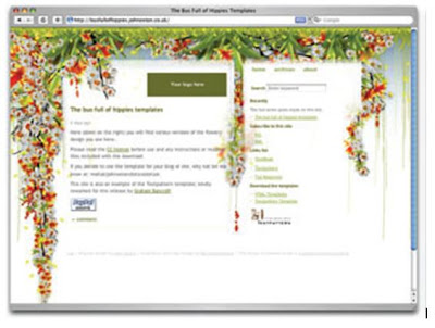
John Ox ton’s Bus Full of Hippies template (pictured in Figure 1.2) is a great example of a design that’s both beautiful and usable. The colorful graphics grow around the blocks of content, leading the eye back to the information without interfering with the pages’ readability or organization.
Figure.1.2:.The.Bus.Full.of.Hippies.template Users can move about easily via intuitive navigation
We’ll talk more about the placement of navigation later, but the main navigation block itself should be clearly visible on the page, and each link should have a descriptive title. A navigation structure that not only changes appearance on mouse hover, but also indicates the active page or section, as does the menu shown in Figure 1.3, helps users recognize where they are, and how to get where they want to go.
Figure.1.3:.A.navigation.menu.from.Iconfactory’s.Halloween.2006.theme
Secondary navigation, search fields, and outgoing links should not be dominant features of the page. If we make these items easy to find, and separate them visually from the content, we allow users to focus on the information, though they’ll know where to look when they’re ready to move on to other content.
Users recognize each page as belonging to the site
Even if there’s a dramatic difference between the layout of the homepage and the rest of the site, a cohesive theme or style should exist across all the pages of a site to help hold the design together. Take a look at the screenshots of Steve Smith’s Ordered List in Figure 1.4. Although the content blocks on these pages are divided differently, there are several visual indicators that let users know that these are pages from the same site. Much of this unity is due to the repetition of the identity and navigation blocks. The consistent use of a very limited color palette (black, white, green, and cyan) also helps to unify the pages.
Figure.1.4:.Pages.from.Ordered.List


