Jumat, 16 Januari 2009

Proportion

One interesting way of creating emphasis in a composition is through the use of proportion. Proportion is a principle of design that has to do with differences in the scale of objects. If we place an object in an environment that’s of larger or smaller scale than the object itself, that object will appear larger or smaller than it does in real life. This difference in proportion draws viewers’ attention to the object, as it seems out of place in that context.

In Figure 1.22, I’ve taken my monkey and superimposed him over the skyline of Manhattan to prove my point. Between the sharp contrast in color, and the difference in proportion, your brain immediately says, “Hey, something’s not right here,” and you’re left staring at the monkey until you force yourself to look away.


Figure 1.22: Proportion—a monkey in Manhattan

This principle works for miniaturization as well. If you take a look at my personal web site, Jasongraphix, pictured in Figure 1.23, one of the first things you might notice on the page is the mini-me leaning against my artwork just under the logo. As with the I want one! Button on Woot, this little guy stands out because of contrast and isolation, but also because of the eye-catching use of proportion.


Figure 1.23: Jasongraphix my personal site, featuring mini-me!

A few standard HTML tags and CSS properties have been designed to take advantage of the preceding theories to create emphasis in a web page even without customization. For isolation of content consider the block quote element. This element indents the left- and right-hand side of any text placed within it, purposely breaking the continuation lines of the page content and drawing attention to itself. For positioning, consider the position property in CSS. By absolutely positioning an object with CSS, you take it out of the low of its containing block, so you can place it strategically to draw attention. And when you think about contrast, think about the blink tag. Just kidding! Don’t ever think about the blink tag. Yes, it creates contrast … over and over and over again. Please don’t use it. Don’t get any ideas about using a marquee tag either. Design is just as much about what we leave out as it is about what we put in.

Next, we’ll look at some well-tested examples of designs from which you can work.

Contrast

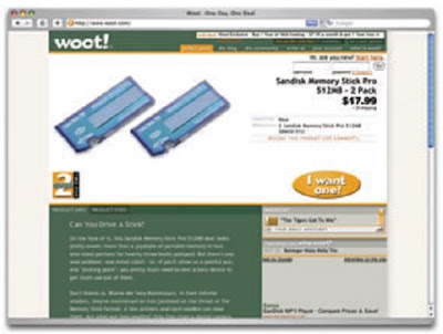
Contrast is deined as the juxtaposition of dissimilar graphic elements, and is the most common method used to create emphasis in a layout. The concept is simple: the greater the difference between a graphic element and its surroundings, the more that element will stand out. Contrast can be created using differences in color (which I’ll discuss in more detail in Chapter 2), size, and shape. Take a look at Figure 1.21.


Figure 1.21: Woot using orange for contrast

The site is Woot, an ecommerce web site that sells just one item per day. When you look at this layout, what’s the first thing that grabs your attention? My guess is it’s probably the product they’re selling. Products at Woot change daily, though, so what grabs your eye I want one! Button although the same colors are used elsewhere after that? For me, it’s the in the design, the oval shape isn’t. When set against an area of white space, the button has both contrast and isolation working to emphasize it. The owners of Woot really want you to click that button.

Isolation

In the same way that proximity helps us create unity in a design, isolation promotes emphasis. An item that stands out from its surroundings will tend to demand attention. Even though he’s sad to not be with his buddies on the other page, the isolated monkey in Figure 1.20 stands out as a focal point on the page.


Figure 1 20: Isolation

A sad monkey

Continuance

The idea behind continuance is that when our eyes start moving in one direction, they tend to continue along that path until a more dominant feature comes along. Figure 1.19 demonstrates this effect. Even though the bottom splotch is bigger and tends to catch your eye first, your brain can’t help but go “Hey, looky there, an arrow!” You’ll soon find yourself staring at the smaller object.

Continuance is also one of the most common methods that web designers use to unify a layout. By default, the left edge of headings, copy, and images placed on a web page form a vertical line down the left side of a page before any styling is applied. A simple way to expand on this concept is to use the rule of thirds to line up other page elements along the lines of your grid.

Placement

Although the constraints of practical web design do not often allow for it, the direct center of a composition is the point at which users look first, and is always the strongest location for producing emphasis. The further from the center an element is, the less likely it is to be noticed first; for an example of this, see Figure 1.19.


Figure 1.19: Continuance and placement—creating emphasis

Senin, 05 Januari 2009

Emphasis

Closely related to the idea of unity is the concept of emphasis or dominance. Rather than focusing on getting the various elements of a design to it together, emphasis is about making a particular element draw the viewer’s attention. When you design a web page layout, often you’ll identify an item in the content, or the layout itself, that you want to stand out. Perhaps it’s a button you want users to press, or an error message that you want them to read. One method of achieving such emphasis is by making that element into a focal point. A focal point is anything on a page that draws the viewer’s eye, rather than just feeling like part of the page as a whole or blending in with its surroundings. As with unity, there are a few tried and true methods of achieving a focal point.

Repetition

A gaggle of geese, a school of fish, a pride of lions. Any time you bring a set of like items together, they form a group. In the same way, repetition of colors, shapes, textures, or similar objects helps to tie a web page design together so that it feels like a cohesive unit. The example in Figure 1.17 illustrates repetition. Even though there are other similar strokes around, the nine red strokes on the left-hand side appear to be a unified group because they repeat a shape, color, and texture. The strokes to the right of this group have no repeated pattern, so they appear isolated even though there are other shapes nearby.


Figure 1 17: Creating a group using repetition

Whether you notice it or not, repetition is often used in web site designs to unify elements of the layout. A good example of this concept at work among unmodified HTML elements is the bulleted list. The bullet that precedes each list item is a visual indicator that the bullet items are parts of a whole. Repeated patterns and textures can also help to unify a design. Take a look at the screenshot of Left Justified, the personal site of Australian designer Andrew Krespanis. This layout contains many eye-catching elements, but the repeated use of the red wood texture in the header, menu, and page borders literally hold this design together.


Figure 1 18: Left Justified homepage

Proximity

Proximity is an obvious, but often overlooked way to make a group of objects feels like a single unit. Placing objects close together within a layout creates a focal point toward which the eye will gravitate. Take a look at the digital painting in Figure 1.15. While composed of a seemingly random assortment of strokes, the five strokes that are the closest together appear to form a unified object.


Figure 1.15: Creating a group using proximity

We practice the concept of proximity on the Web when we start setting margins and padding for elements. For instance, when I define the CSS style rules for most sites, I usually change the default margin that exists between common HTML elements such h1, h2, h3 …), paragraphs, block quotes, and even images. By altering these as headings (values, I can cause more or less space to appear between elements, thereby creating groups.

If you look at the two columns of text in Figure 1.16, you’ll notice that they look very similar. The only difference is in the placement of the headings. In the column on the left, the word “Unkgnome” is equip-distant from the top and bottom paragraphs. This results in a heading that looks more like a separator than a heading for the next paragraph. In the second column, the “Gnomenclature” heading is placed closer to the paragraph that follows it. In accordance with the rules of proximity, this heading appears to belong to that block of text.


Figure 1.16: Proximity between headers and content

Unity

Design theory describes unity as referring to the way in which the different elements of a composition interact with one another. A unified layout is one that works as a whole rather than being identified as separate pieces. Take the monkeys in Figure 1.14, for example. Their similar colors and shapes mean that they can easily be recognized as forming a group, rather than merely being four monkeys.

Although it’s not such an issue these days, unity is one of the many reasons why web designers have always despised HTML frames. It’s important that unity exists not only within each element of a web page, but across the entire web page—the page itself must work as a unit. We can use a couple of approaches to achieve unity in a layout (aside from avoiding frames): proximity and repetition.


Figure.1 14:.Unity.among.the.monkeys

Asymmetrical Balance

Asymmetrical balance, or informal balance, is a little more abstract, and generally more visually interesting, than symmetrical balance. Rather than having mirror images on either side of the layout, asymmetrical balance involves objects of differing size, shape, tone, or placement. These objects are arranged so that, despite their differences, they equalize the weight of the page. If you have a large object on one side of a page, and you partner it with several smaller items on the other side, the composition can still feel balanced.

The concert poster by my friend Jeremy Darty presented in Figure 1.11 is a fine example of asymmetrical balance. The visual weight of the large pink flamingo on the left is balanced by the combined weight of the smaller flamingos and small text blocks on the right-hand side of the layout. Notice also Jeremy’s use

of the rule of thirds. The blue cloud behind the Pop Sucks title takes up one-third of the vertical space and spans two-thirds of the horizontal.


Figure 1 11: Asymmetrically balanced design by Jeremy Darty

Take a look at the photo of the three stones in Figure 1.12. It may not be a particularly exciting picture, but as far as balance goes, it rocks! If you were to use a piece of paper to cover any one of the three stones below, the entire photograph would feel unbalanced and unfinished. This is generally the way balance works. It’s as if the entire composition is in a picture frame hanging by a single nail on the wall. It doesn’t take much weight on one side or the other to shift the entire picture off balance.


Figure 1 12: Asymmetrical rocks that don’t roll

Unlike symmetrical balance, asymmetrical balance is very versatile, and as such, it’s used much more often on the web. If you take a look at most two column web site layouts, you’ll notice that the larger column is often very light in color—a tactic that creates a good contrast for the text and the main content. The diminutive navigational column is often darker, has some sort of border, or is made to stand out in some other way, in order to create balance within the layout. John Hicks’s site, Hicks design, which is shown in Figure 1.13, is an excellent example of asymmetrical balance. The heavy brown sidebar, which contains the logo and main navigation for the site, stays fixed on the right-hand side of

the layout even when the content scrolls. This ever-present element provides interest and balance to the rest of the content on the page.


Figure 1 13: Hicks design—an example of asymmetrical balance

Many principles are at work in the design of John Hicks’s site—this design isn’t just about asymmetrical balance. The site has great harmony, which comes from the repeated, brightly colored bullets, similarly colored headers, and consistent typefaces. Part of that harmony arises from the fact that the site meets the principles of unity.