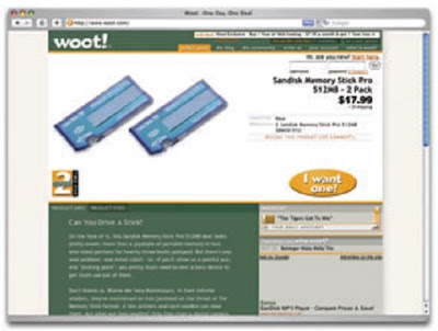
Contrast is deined as the juxtaposition of dissimilar graphic elements, and is the most common method used to create emphasis in a layout. The concept is simple: the greater the difference between a graphic element and its surroundings, the more that element will stand out. Contrast can be created using differences in color (which I’ll discuss in more detail in Chapter 2), size, and shape. Take a look at Figure 1.21.
Figure 1.21: Woot using orange for contrast
The site is Woot, an ecommerce web site that sells just one item per day. When you look at this layout, what’s the first thing that grabs your attention? My guess is it’s probably the product they’re selling. Products at Woot change daily, though, so what grabs your eye I want one! Button although the same colors are used elsewhere after that? For me, it’s the in the design, the oval shape isn’t. When set against an area of white space, the button has both contrast and isolation working to emphasize it. The owners of Woot really want you to click that button.

Tidak ada komentar:
Posting Komentar